I designed a postcard to advertise for the University of Massachusetts Lowell B.F.A. Graphic Design Exhibition. This was sent to prospective students, alumni, family and friends.
ProcesS
On the right is one of the iterations of the postcard. Originally, I added highlights for headers/ subheads, according to the original brand guidelines. The branding team decided to remove this requirement, which led to a shift in my designs. I wanted to add details to the postcard without overpowering the typography and information, I felt the line callouts accomplished this.

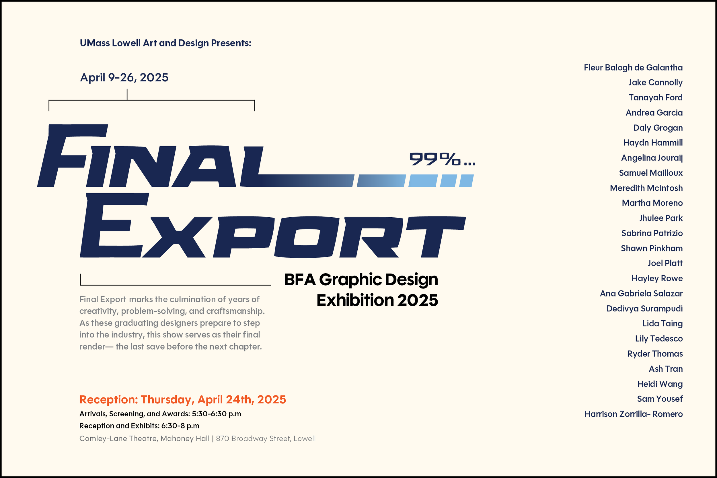

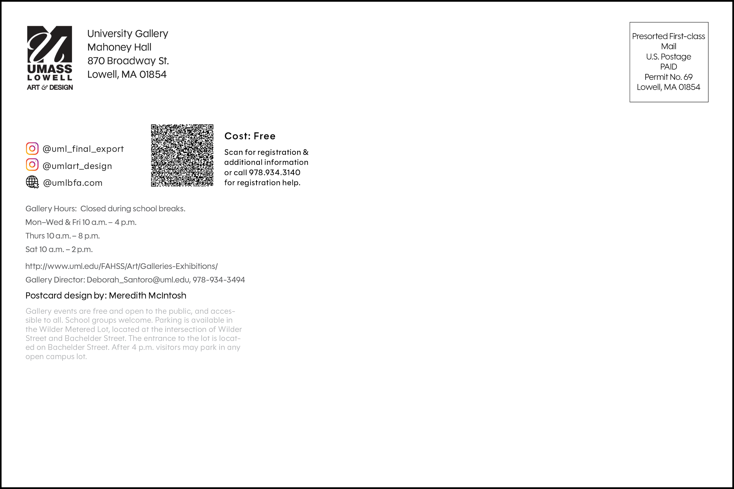
The Final Design
Out of the three drafts above, my professor and I felt the one on the left worked the best. For the front of the card, I made some minor edits and provided the final design below. For the back of the card, I made a few changes- like the light gray running text. Overall, I am happy with the outcome and how it printed.